Lendahand
Lendahand is an online impact investment platform where socially conscious investors can invest in SME’s and sustainable initiatives in emerging economies around the world. Not only will this type of investment hopefully see a financial return, it creates jobs and helps people in developing countries improve their access to basic needs.
Challenge
How do you attract and retain investors in an increasingly brand savvy sector?
While the social purpose of Lendahand was clear, visually they were worlds away from the increasingly slick financial brands in their sector. With such a distinct and directional name, they needed a visual identity to match. Our brief was to give them a visual refresh that would increase trust in the brand and attract younger investors.

Approach
Due to the descriptive nature of the brand name, the previous identity featured a stylised hand symbol. However, this marque was far too complex, felt very dated, and was not fit for purpose in the digital world.
Our starting point was to rethink the hand symbol and make it feel more modern and dynamic, whilst also giving it the ability to add some personality and character to the brand. This acted a spring board for the rest of the identity, and allowed us to produce patterns and iconography which internal teams could use in their communications.


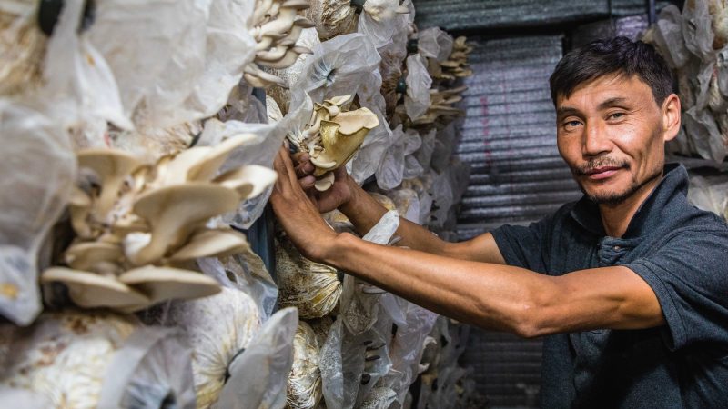


Impact on-the-ground
We wanted the new identity to showcase the impact that these type of investments have on the lives of the people in the developing countries Lendahand operates in. Opmeer Reports were commissioned to capture imagery of various projects across the world which clearly shows investors where their money goes and the effect it is having.
Dynamic, but trustworthy
Any type of financial investment is a serious subject. So while we wanted to make the visual identity more modern and dynamic, we had to ensure that the platform felt trustworthy and retained a sense of seriousness. To help strike this balance, we chose a colour palette that mixed bright colours with a rich, warm green.


Thisaway really understood the challenges we faced as a business, and they quickly got to grips with what our needs were. Their communication throughout the whole process was excellent, and we always felt that we were in good hands every step of the way. The end result surpassed all of our expectations. It’s really energised everyone within the business, and the reactions from our investors have been really positive. We’re trying to make the world a better place for everyone, and our new identity gives us an amazing platform to do just that. Thank you!
Project disciplines
Brand identity, tone of voice, digital design.