Team GB
Team GB is the external facing brand owned and managed by the British Olympic Association. 100% commercially funded, its primary role is to unite, organise and prepare athletes from all Olympic sports, disciplines, and governing bodies as they compete together under the Union Flag.
Ahead of Paris 2024 and beyond, the BOA were looking to maintain and grow the brand’s profile amongst fans of all ages and backgrounds, strengthen its relationship with sponsors and commercial partners, and make sure it would be fit for today’s modern, digital-first communication landscape.

Challenge
Increase reach and relevance throughout the entire Olympic cycle
Team GB is a much-loved brand — ranking 2nd, just behind the NHS, in a survey of ‘what makes people proud of Britain’. But, whilst sentiment is strong and engagement is high during each summer or winter Games, the brand needed to work harder to drive increased relevance outside of Games time, particularly with younger audiences.
The brand needed to evolve strategically and visually. To develop a clear and compelling purpose and promise that could maintain the DNA of what has made it so successful, but also resonate deeper, across multiple channels, with athletes and audiences alike. It also needed to facilitate content that would engage and inspire the nation, not just during the Games, but every single day.


Insight
Embrace a truth that makes Olympic sport so unique
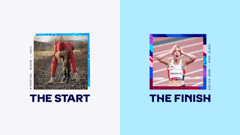
Elite sport, by its very nature, can be elitist. Elevating sportsmen and women into super-human stars. Putting them on a pedestal, out of touch with everyday life and out of reach from everyone else. But not the Olympic Games — and that’s why Team GB is different. At the heart of the brand has always been a simple but compelling observation: that when it’s at its best, Team GB helps and facilitates ordinary people to achieve extraordinary things. This is what makes the brand so unique, its athletes so loved, and its stories so compelling. And it’s where we found our idea.
Idea
Everyday Extraordinary
With a simple evolution of the brand’s existing slogan ‘Believe in Extraordinary’, we’ve moved it away from an athlete-focussed rallying call and into an inclusive and inspirational articulation of the new purpose: To bring people together through the power of stories steeped in authenticity and emotion. To celebrate superhuman endeavours and the humanity that lies behind them. To champion what makes our athletes so special, as well as what grounds them. To show their rich diversity and unbreakable unity. And above all else, to unite and inspire our nation to find their own extraordinary.


A diverse design system
With the brand needing to move beyond Games time and start engaging audiences throughout the whole four year Olympic cycle, it was important that it had the flexibility to dial up and down, to represent the everyday as well as the extraordinary, and to resonate with a wide variety of different audiences.
To do this we created a simple but flexible design system all based around a core set of patterns. Inspired by some of the key qualities and attributes that make up a successful athlete, the patterns are intentionally expressive and abstract, meaning they can be applied freely across the brand without being nailed down to one particular sport.

The patterns are used in a variety of ways across the brand, ranging from simple, subtle applications on the more everyday end, to a set of full colour, event themed pattern illustrations on the extraordinary end.


Owning red, white and blue
As with many sport brands, colour was a point of contention. Obviously red, white and blue is synonymous with Great Britain, but it’s far from unique, with other competing nations such as France and USA also sporting the same colours. We needed to find a way of refreshing Team GB’s colour palette in a way that is both flexible and ownable.
Rather than trying to look beyond the traditional colours, we decided to embrace them and push the iconic red white and blue as far as we could. The result is a vibrant and varied colour palette that has the versatility to be restrained and traditional in one breath, and bold and contemporary in the next. The core palette is also complimented by the three other colours that go hand-in-hand with the Olympic Games; gold silver and bronze.


A Great British typeface
In a world full of heavy, condensed, sporty typography, we wanted to set Team GB apart with a far more approachable typeface. Working closely with typographer, Lewis McGuffie, we created Team GB Sans, a distinctive and flexible typeface with a classic British influence and a set of stylistic alternates that reflect movement, energy and diversity.
Continuing the theme of versatility, the typeface was designed to be clear and legible for everyday use, whilst having a dynamic and distinctive set of alternates for more extraordinary application.

Gold standard rollout
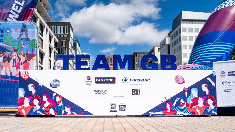
In the build up, and during the Games, the brand was rolled out across many touch points and channels by multiple teams, both internally and externally. The execution of the brand was exceptional, and our big idea, ‘Everyday Extraordinary’ has been a consistent thread that has knitted everything together nicely.
From fanzones and merchandise in supermarkets, to Team GB House in Paris and the homecoming party in Manchester, in every scenario the strength of the brand shone through.


From the very beginning of the project Thisaway challenged us to broaden the vision and purpose of our brand. That meant that our new positioning not only enables us to continue to inspire our athletes and coaches but also engages the wider UK population throughout the Olympic cycle. This, married with the fresh and dynamic new identity, has given the organisation a renewed energy and confidence. We now have a fantastic platform to help us achieve our commercial and sporting goals as we build towards Paris 2024.
Scott Field, Director of Communications and Marketing, Team GB
Project disciplines
Brand strategy, brand architecture, brand identity, tone of voice, photography, illustration, animation, copywriting, brand guidelines brand rollout, brand guardianship.
Project collaborators
Typeface design: Lewis McGuffie