
- Insight
Can Design Help FIFA Stage Its Own Comeback?
Football is filled with incredible comeback stories. Last minute screamers, drama-addled penalty shootouts, and countless David vs Goliath stories. Now, FIFA, the global footballing body, is challenged with reversing its own fortunes.
The litany of controversies surrounding the 2022 World Cup in Qatar are well known by now: still disputed migrant deaths during stadium construction; the country’s position on LGBTQ+ rights and the silencing of people supporting these communities throughout the event. Even banning Budweiser, the tournament’s beer partner for 36 years, from stadiums at the 11th hour diminished perceptions of a tournament that was doomed before the first whistle. But once the news cycle inevitably trudged on, how much would the ghosts of FIFA’s past (which long predate Qatar) come back to haunt it further down the line?
Well, it’s complicated. Let’s not forget that FIFA is also home to the Women’s World Cup, which has somehow managed to carve out a sub-brand that’s far more feel good than the men’s tournament. The response to the identity for the forthcoming women’s tournament – which may well have offered a blueprint for the 2026 identity – seemed overwhelmingly positively on social media. And for a long time, FIFA was attached to the EA Sports football gaming franchise, which in recent years had arguably become the most wholesome face of the FIFA ecosystem thanks to a number of creative or purpose-led initiatives. However the series will soon be known as EA Sports FC after both parties reportedly failed to agree on a licensing deal. Without it, there is perhaps even less room for FIFA to hide.
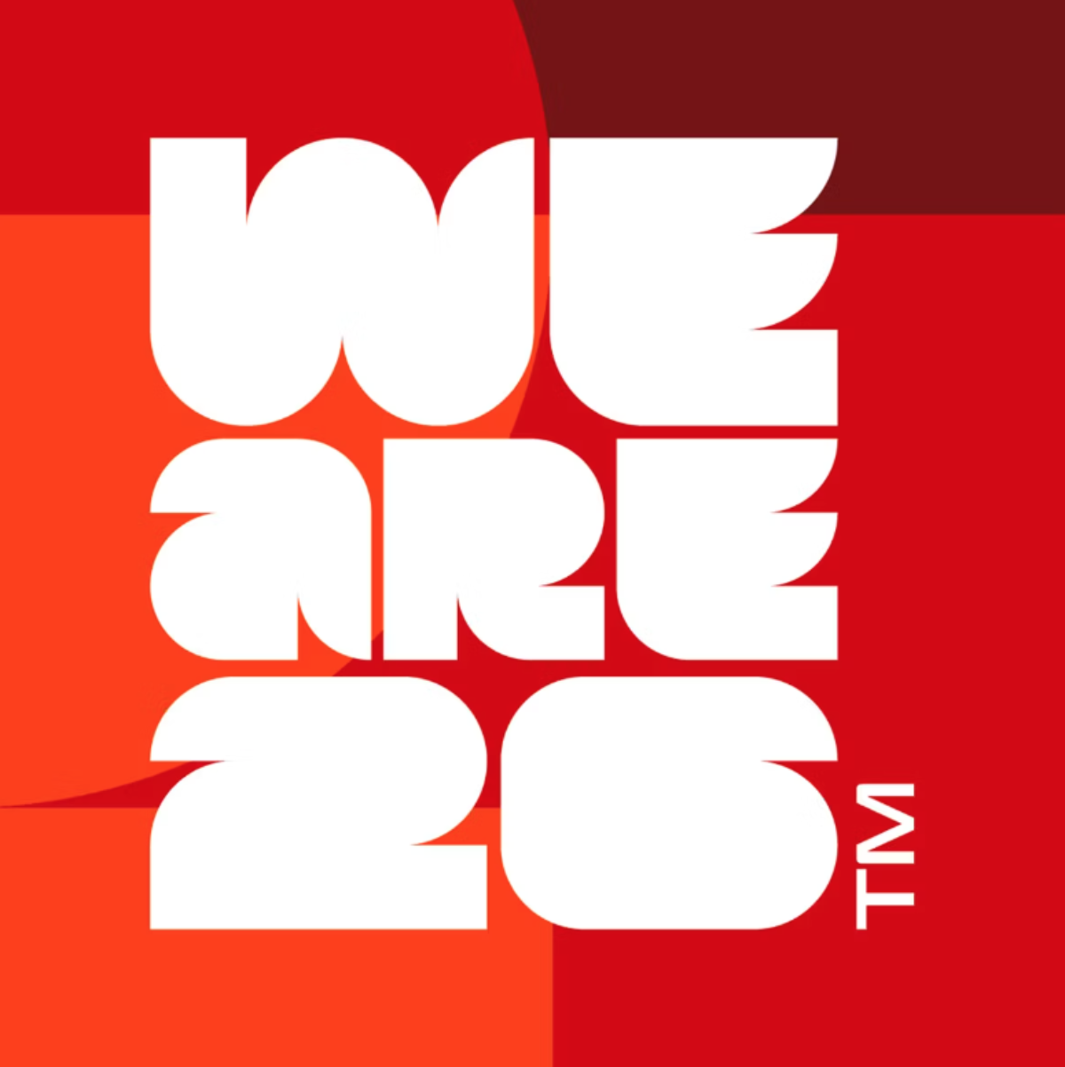
The recent launch of the 2026 World Cup identity was the first real litmus test for FIFA since Qatar. The occasion is supersized in every way – 48 teams, three countries, both firsts for the tournament – and the designs appear to tap into that. The palettes are bright and jubilant, the typography thick and abstract, and the designs are intended to be customisable for different host cities – referenced in the accompanying We Are 26 brand campaign – to slot into.

Rick Banks, graphic designer, typographer and founder of F37, was pleasantly surprised when he first laid eyes on the 2026 identity. Banks, a football fan and author of the coveted Football Type books, believes that the World Cup has never really had a legacy of great logo design, so he was pleased to see something different with the new identity: “When I saw it I was quite shocked. I was expecting the same throwaway, tired, forgetful graphics we are used to seeing. The same old logos that stink of ‘design by committee’.” He commends the designers involved for “getting something good past so many levels of approval”.
“In terms of the typography I’m a sucker for chunky display sans serifs. The custom typeface, although nothing groundbreaking, really works well in this logo lockup. It works as patterns, 2D graphics and as an animated graphic device — crucial in the digital world. I also like how the lockup acts as a window device to showcase the highlights of the World Cup.”
While he says that the 2026 identity is a “huge improvement and step in the right direction”, he would like to see “something more out there and unique – like the London Olympics branding”, a design identity that was notoriously divisive when it first launched, but has been more warmly embraced by people over time.

As founder and creative director of branding and design agency Thisaway, Graeme Cook has worked with a range of sports clients, including an extensive redesign journey with Brentford FC. He agrees that the 2026 World Cup identity strikes out on its own compared to previous tournament identities – and in fact he was reminded of London 2012, if not visually then in terms of his response to it.
“When I first saw the [2026 World Cup] logo I thought it felt like a different approach to previous World Cup identities, whose use of stylised illustrative elements have historically felt overly fussy, not digital-friendly and often quite samey. This logo felt bolder, more graphic and at least hinted at a wider identity system,” he says.
However, he says, some elements “don’t quite hit the mark”. “For a brand with such a focus on digital and social channels, the use of the trophy image within the logo feels a little ill considered. Using a photographic image feels like an after thought, and I’m not convinced it will scale down well to work in broadcast graphics or on social media. I’m surprised there isn’t a purely graphic version at the very least,” he says. “I imagine the use of so many colours aims to give the brand a celebratory feel, but in some applications it feels overdone and almost psychedelic.”
“Given the emotive nature, extensive processes and multiple stakeholders involved in these type of projects, I can speak from experience that getting a ‘different’ approach to that which has gone before is no mean feat,” Cook says. “Therefore, I think the sentiment around the general direction and intention of the brand identity is to be commended. I just feel it could have been executed with more craft and consideration.”
While the visual language certainly feels more ‘now’, many people on social media felt that the identity lacked, well, identity. If that’s the case, it’s surely down to the hosting setup for the tournament, which is being split across three nations – each of which are culturally and geographically distinct.
The only other time that more than one nation has hosted the World Cup was the 2002 tournament, which was shared between Japan and South Korea. The logo for the event, created by Interbrand, included an image of the trophy as well as the FIFA World Cup logotype for the first time, clearly putting a FIFA stamp on the event.

At the time, Interbrand’s Andy Milligan explained that the identity sought to find mutual “artistic principles and traditions” between both countries, including “asymmetry, dynamism and harmony”, that would “live up to the high quality of design for which both countries are renowned”.
Representing two countries isn’t easy – three seems a nigh-on impossible design challenge. “The fact that there are three host countries in 2026 means it’s far harder to incorporate national flags and symbolism in one logo,” says Cook. “Therefore I could understand the thinking behind the ‘vessel for self-expression’ approach to the marque and wider typeface, as it enables the brand to showcase imagery, illustration and the colours of each host nation within these shapes.
“I would have liked to have seen some kind of visual reference to each of the three host nations within the identity,” Cook continues. “Whether it be a typographic detail or additional brand assets, I feel like it could have added some richness to the visual identity system.”
Vivek Bhatia, creative director at design and branding studio Ico, believes that the issues people have with the branding come back to the brand itself. Last November, the studio staged a response to the controversial 2022 World Cup, by inviting a range of creatives to contribute to an illustration project that drew attention to the human rights issues and generated support for a dedicated charity working to address them directly.
Bhatia echoes that the 2026 tournament setup was always going to pose challenges, but that that’s the bed the organisation has made for itself: “FIFA has made the World Cup less about the universal beautiful game and more about making ever-increasing amounts of money. Yes, we’ll all love the football – increasing the teams from 32 to 48 will mean it goes on for even longer,” he says, “but let’s be clear – they haven’t done this to be more inclusive. The new identity has become a symbol of this – it can’t be specific because it’s being played in three nations.”
He can just about see the argument for the simple “let’s show the trophy in the year” logo. “One could argue it becomes a carrier and allows the content around it to be specific – to be a rich mix of host cities, fans, footage and all things football – a bit like Wolff Olins’ NYC logo.” But to him, it says more about FIFA’s muddled direction.
“Personally, I don’t mind a departure from the overly decorative logos of recent years but there’s a lack of imagination here that is related to the one-dimensional focus of FIFA,” he says, “which is to bleed the game dry – three destinations making it incredibly expensive for fans, even more travelling for teams and more advertising for sponsors covering even more games. It’s a shame FIFA aren’t a greater force for good. If they were I think their new logo for the next World Cup would have a more welcomed response.”
Gabi Mostert, creative director at Homeground – a young creative agency that specialises in sports, was initially surprised by the identity. “On first glance, I enjoyed its Psilocybin-inspired vibes. It didn’t look like a typical World Cup identity, which was refreshing,” she says. “But then I remembered it wasn’t for Pride or Lovebox.”
In reality, she see it as a case of “using great design to masterfully disguise the scary side” of the organisation. “The vibrant colours and soft edges of the shapes and fonts make it look warm, fuzzy and fun. Like a dodgy old van with ‘Free Candy’ written on the side. Using visual tricks to hide its true intentions. Even the line #WeAre26 feels like it’s trying to distract you from its own dark underbelly.”
Cook believes that audiences are too attuned to the organisation’s track record these days to be won over by jolly branding. “Given the gravity of the controversies that FIFA has been through and the issues it continues to struggle with, a new ‘lick of paint’ will do little to encourage critics to move on. The lipstick on a pig analogy springs to mind.
“That said, branding in its strategic sense could help FIFA identify what they actually stand for in the world and help them establish the role they want to play. As governing body to the world’s most played and watched sport, its reach is unparalleled, but establishing trust with the masses again would be key,” he says. Essentially, any progress must be reflected on and off the pitch, rather than just in brand toolkits.
“‘Purpose’ is a hot topic in branding at the moment, but I think a brand like FIFA could definitely benefit from having a more purposeful outlook and mission. They could take a more active role in helping tackle global issues like racism and the climate emergency, but it would have to be authentic and have substance to get a sceptical global audience back on board,” he explains. “Essentially, to shift perceptions of FIFA as a brand and a business, they will be judged not by a shiny new brand but by the actions they take. They need to do more, but they also need to do what they do, better.”
Banks stands by his positive assessment of the FIFA World Cup 2026 identity, but agrees it doesn’t go far enough. “Although the branding is lovely, bold and progressive, it will take a lot more to change their image of corruption.”